This should be a much longer post, with many more citations.
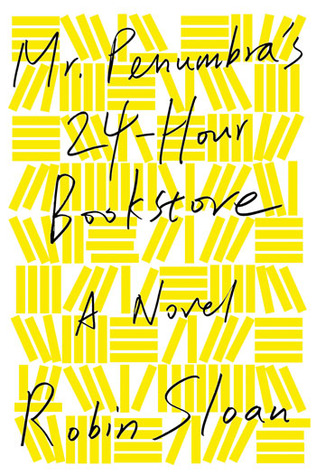
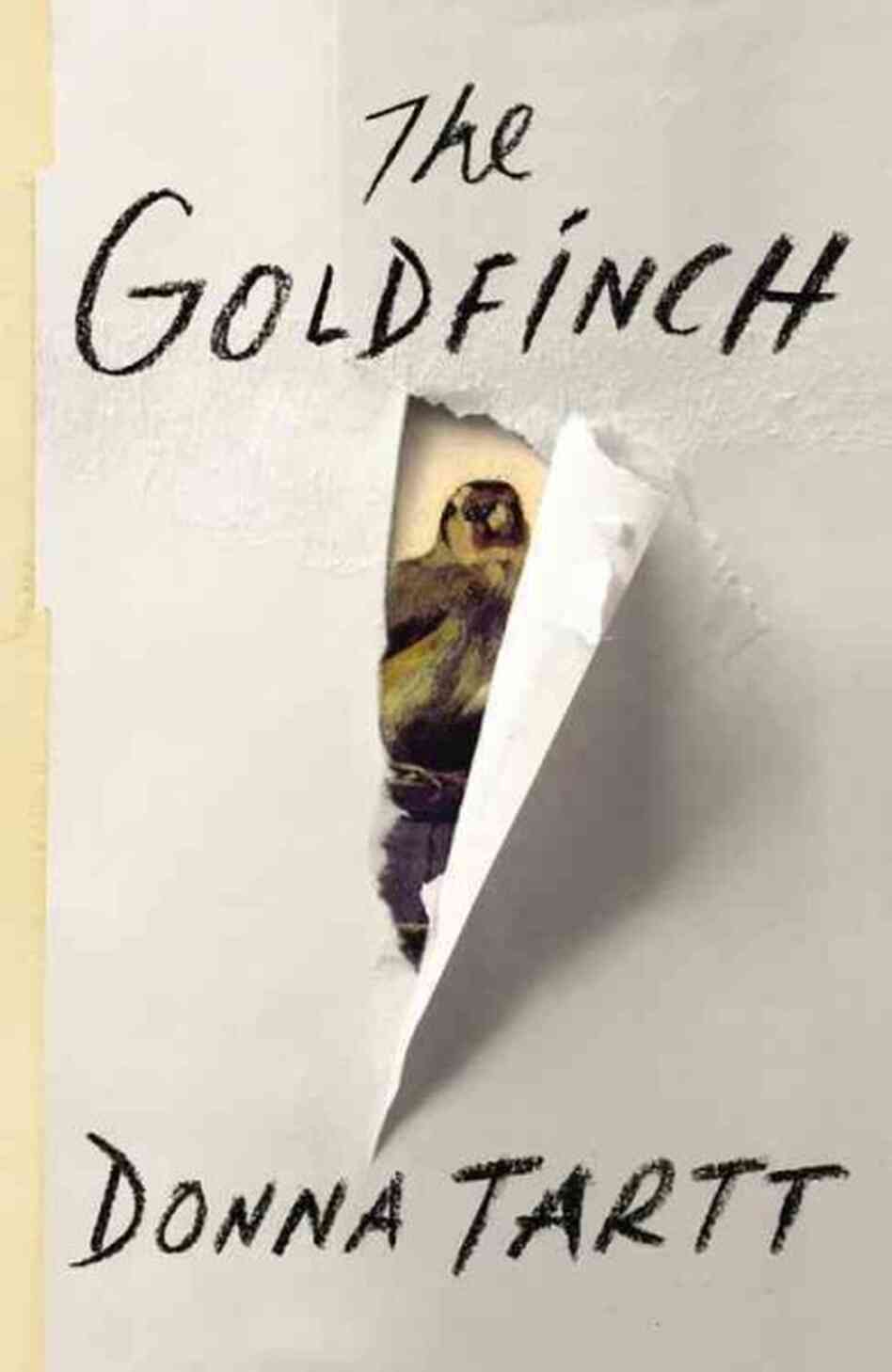
But basically, as I have been immersing myself in book jacket design, and paying hawk-like attention to the look of literary novels everywhere I go, I've noticed a trend for illustration on covers, and especially hand-lettered titles.
I first noticed it after seeing the exact same trend in wedding invites to an overwhelming degree (maybe because I'm getting married and am designing my own invites, which, yes, I set in lead type and hand-printed, so I am a bit of a luddite and a hipster don't judge me). I love the look, but it seems layered in that postmodern, hipster irony of reproducing the nostalgia for the thing using the very technology that has replaced it. Especially when the hand-lettering is then printed using letterpress, but rather than using lead type (as is PROPER), using a photopolymer plate. Double layers of obsolete technology!
But I digress.
I do love the look, but the book world is getting a bit saturated with it. It make zero sense to me, for example, for Jhumpa Lahiri's new novel to have a parchment cover and watercolored words:
Seriously, what does that tell you about the book? Other than that the graphic designer who made the jacket likes to underline things. It has no connection with her previous work, even though her last book, with its gorgeous cover, was published by the same house.


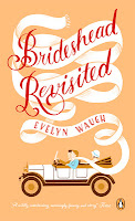



But basically, as I have been immersing myself in book jacket design, and paying hawk-like attention to the look of literary novels everywhere I go, I've noticed a trend for illustration on covers, and especially hand-lettered titles.
I first noticed it after seeing the exact same trend in wedding invites to an overwhelming degree (maybe because I'm getting married and am designing my own invites, which, yes, I set in lead type and hand-printed, so I am a bit of a luddite and a hipster don't judge me). I love the look, but it seems layered in that postmodern, hipster irony of reproducing the nostalgia for the thing using the very technology that has replaced it. Especially when the hand-lettering is then printed using letterpress, but rather than using lead type (as is PROPER), using a photopolymer plate. Double layers of obsolete technology!
But I digress.
I do love the look, but the book world is getting a bit saturated with it. It make zero sense to me, for example, for Jhumpa Lahiri's new novel to have a parchment cover and watercolored words:
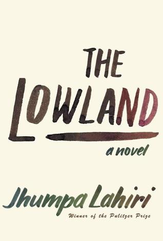 |
| Lahiri's most recent book, The Lowland |
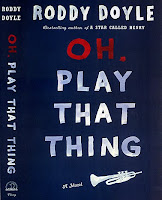
Anyways, I do think that it can be used well, but I think it's interesting that it's being used across so many genres, whereas oftentimes typeface choices are so genre-limited. I noticed the following books in particular because they use a hand-lettered title, but it seems to jar with the genre, content, or audience one would think the publisher and author are trying to convey. Is this a case of graphic designer revolt?



I am sure these are all lovely books. Who could turn their nose up at Achebe? Roddy Doyle will have you laughing your head off. But WHY use the same signifiers for fiction and non-fiction? The answer has to be the aura of the handmade object, and the attempts of fine books to look not mass-produced, to look special, to look like you really need to buy and own this precious, hand-made just-for-you object. And to update classics to look fresh (Achebe and Waugh just won't resonate with current marketplaces otherwise, I guess?). As paper books war with ebooks for customer dollars, the materiality of the object is becoming emphasized as a positive. Ebooks aren't chipping away at hardbacked sales, but they've destroyed the massmarket, rack-size paperback. If you want to buy something a machine made, you'll download the digital version, and all the books in your pocket library will have the exact same font (typeface), the covers won't matter, and you'll likely delete or remove the book once you're done instead of passing it along to someone else and starting up the oh-so-desired word-of-mouth campaign. So I get the inspiration. It's possibly also behind the emphasis on chalkboards and personalization Etsy has been hammering for years. But you can't apply the same idea to everything! It's the cheap easy way to connect to current trends, but is it servicing the book or just demonstrating the in-the-know-ness of the designer?
OK, to pull my cranky pants all the way up, the worst offender in design, overall, bar none, of recent books in this trend is, in my opinion, Cartwheel.
Holy crap I don't want to ever look at this jacket again (I got like three in their publicity carpet bombing exercise and have been trying to give them away). It makes no sense. I mean, I like the subtle curve in the actual title, and the spokes radiating from the center do evoke an actual cartwheel, but overall it just feels scattered and totally, totally unrelated to the novel -- and doesn't even have the excuse of echoing her previous book. There's a bird, and what seem to be post-its with rough-pencilled scrawl -- but as described in the jacket copy, the novel is basically a ripped-from-the-deadlines fictionalization of the Amanda Knox story. What the heck is the connection of this pinwheeling cover to an international tale of lurid crime and uncertain guilt? How does this stylishly designed cover tell me anything at all about the book? The cover is a vital piece of information to help a reader engage with a book, and this one, I believe, does a horrible disservice to book and author. It feels like a designer got fed-up with feedback and Portlandiaed the jacket.